This is the second part of this series. Here we are going to see how to prepare our website for lead generation with Google Ads. Let’s dive into the specifics and see how you can leverage it too.
Read the first part of this series here.
Keep it Ready: Persona
First things first, knowing your audience is the backbone of any successful marketing campaign. Imagine if you’re a Chetan Bhagat or Amish Tripathi, successful Indian authors, crafting a new novel. You wouldn’t write without understanding your readers’ preferences, would you?
The same principle applies to your business. Your ‘reader’ is your customer. Recognise their characteristics, study their pain points, understand their goals, identify what they read, and determine where they live. This understanding will be the foundation of your Google Ads strategy.
Once you have prepared some personas, let’s move on to the website. Now we are going to modify the website keeping these personas in mind.
Get more tips on Consumer Psychology and prepare a better buyer persona by clicking here.
Making Your Website User-Friendly: On-site Optimization
Think of your website as your digital storefront. If you own a physical store, you would make sure it’s clean, organised, and welcoming to your customers, right? Similarly, your website should be welcoming, relevant, and easy to navigate.
Define Your Landing Pages Based on the Ad
Let’s say you run an online tutoring service, ‘Qrious Minds.’ You need to define the specific pages where you will send traffic from your Google Ads. If someone clicks on an ad about your IIT-JEE preparation course, they should be directed to the page specifically about that service, not your homepage. This is akin to guiding a customer directly to the section of the bookstore that houses their favourite genre.
Homepage & Branded Traffic
When we talk about a company’s homepage, we’re referring to the main landing page for a website. If branded traffic is your major channel, then you should work hard for ‘homepage’.
Branded traffic refers to the visitors that come to a website directly (like typing the URL into the browser) or through organic search results by searching for a brand’s name or specific product of a brand. These individuals already know about the brand and are seeking it out specifically, often indicating a higher level of interest or intent compared to non-branded traffic.
The homepage should be clean enough to guide them towards taking a desired action, like making a purchase or signing up for a service.
One of my favourite example is Dropbox homepage
- Its sub-headline is simple yet powerful
- A large and relevant motion graphics clearly explains why Dropbox
- The more you scroll, the more they build desire by describing different use cases for their tool.
The Art of a Clear Statement of Value
Once your home page design is ready, the next step is the master text.
The website should include a clear ‘statement of value,’ aka master text.
To put it simply, why should a student choose ‘Qurious Minds’ over other tutoring services? Perhaps you have IIT alumni as tutors, or maybe you offer personalised study plans. This statement is your ‘USP’ (unique selling proposition), the cornerstone of your business.
Drafting Your Master Text
Do thorough research and understand why people love your service or product, then highlight it. Most people ignore this part.
In an article I once came across, the CEO of a software company believed that their fast service and competitive pricing were their key selling points. However, a deeper dive revealed that people love them for different reasons. Those were their user-friendly interfaces and local operations in Mexico. Unlike many competitors who operated overseas, their location allowed real-time communication with US clients and facilitated cost-effective, in-person meetings. Moreover, their software was praised for its simplified user interface, offering just the essential features and avoiding overwhelming users with unnecessary functions. By emphasising these strengths in their messaging, they underscored the disadvantages of dealing with distant operations and complex software, effectively reshaping their unique selling propositions.
So think twice before you draft your master text.
Some of my favourite examples are from
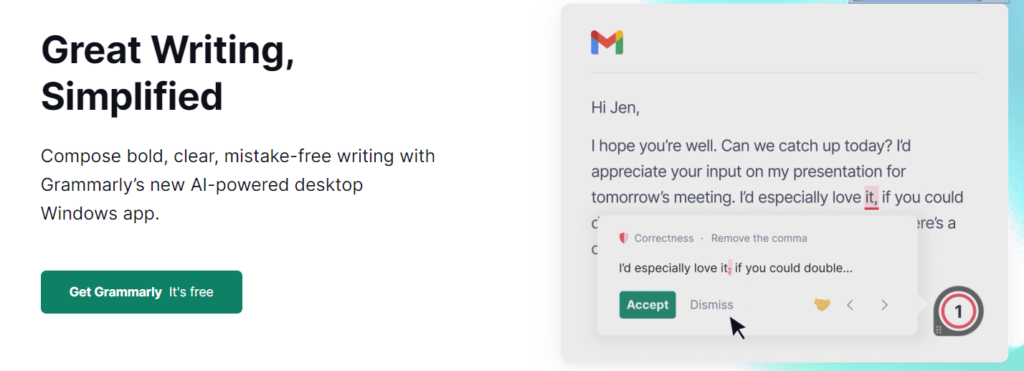
- Grammarly (Short & Sweet)
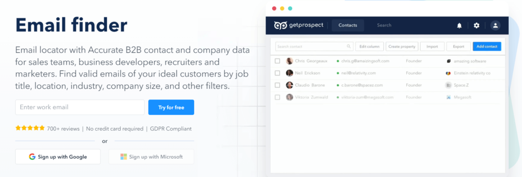
- Getprospect (Nothing fancy, straight to the point, easy to read and comprehend)
The Power of Social Proof
Your site should include social proof. This is the digital equivalent of word-of-mouth publicity. For instance, if ‘Qrious Minds’ has testimonials from previous students who cracked IIT-JEE thanks to your coaching, those reviews would be your social proof.
Aggregating enough reviews takes time, so ask your customers for a review after 30 days of purchase and give them an incentive or reward for completion. Actually, this 30-day time frame is a hack; it gives you at least a few days or weeks to resolve any issues—and get a good review for it.
Authority Bias and the Culture Code Behind Social Proof
There is even a psychology behind it: Authority bias.
Showcase or mention a celebrity using a similar product or service, and leverage that to your advantage by drawing similarities between your audience and this person to convince them to make the purchase to increase their status quo.
Another rationale behind it is culture; you can classify your audience into two types: collectivist cultures and individualistic cultures. India has a collectivist culture. Individualism is about your personal interests; collectivism is about the interests of the group. This group can be your direct family, but it can also be your company or country.
In collectivist cultures, advice from social groups is generally considered important. So, people are more likely to follow the ratings of other users.
Crafting Clear Calls-to-Action ( CTA )
Imagine being in a bustling Indian bazaar with numerous sellers vying for your attention. Among all the noise, a shopkeeper with a loud, clear voice stands out, inviting you to his shop. Similarly, on your website, amidst the wealth of information, a clear and bold CTA button plays the role of that sales assistant, directing visitors to the next step.
The online retail giant, Amazon, is a prime example of this. Their bold, yellow “Add to Cart” button is highly visible and directs shoppers to the next step of the purchasing process.
Multiple CTAs
Furthermore, your website should have multiple conversion conduits, or Call to Actions (CTAs). This is the digital equivalent of different salespeople for different sections, and eventually they will be guiding the customer to the checkout counter.
For example, after reading about your IIT-JEE course, there should be a clear, visible button that says “Enrol Now” or “Book a Free Demo.”
Blog Section: After reading an informative blog post about the benefits of personalised learning, a CTA could be, “Try Our Personalized Learning Approach! Start Your Free Trial Today.”
Course Description Pages: Each course description should have a clear and concise CTA, like “Enrol in This Course Now!” or “Download Course Curriculum.”
Contact Us Page: On the contact page, a CTA like “Get in Touch with Our Advisors Today” encourages prospective students to reach out for more information.
Free Resources Page: If you offer free study resources, a CTA might be, “Download Free Study Material Now!” or “Access Free Practice Tests.”
Newsletter Subscription: A CTA like “Stay Updated! Subscribe to Our Newsletter” can help grow your email list for future marketing campaigns.
Remember, the goal of each CTA is to guide visitors towards a desired action. A well-crafted CTA is clear, concise, and compelling, using action-oriented language that creates urgency and excitement.
Add Badges, Add Trust & Make it Special
Trust is the cornerstone of any business. Just as a customer feels reassured when they see an ISO certification or FSSAI mark at a restaurant, website verification badges like secure payment, BBB, SSL, guarantees, and free returns can build trust in your online services.
For ‘Qrious Minds’, if you offer free shipping for your study materials or free returns on course enrollments, turn these into badges on your website. It’s like a restaurant highlighting their ‘Hygiene Certified’ status – it provides an extra layer of trust for the customer.
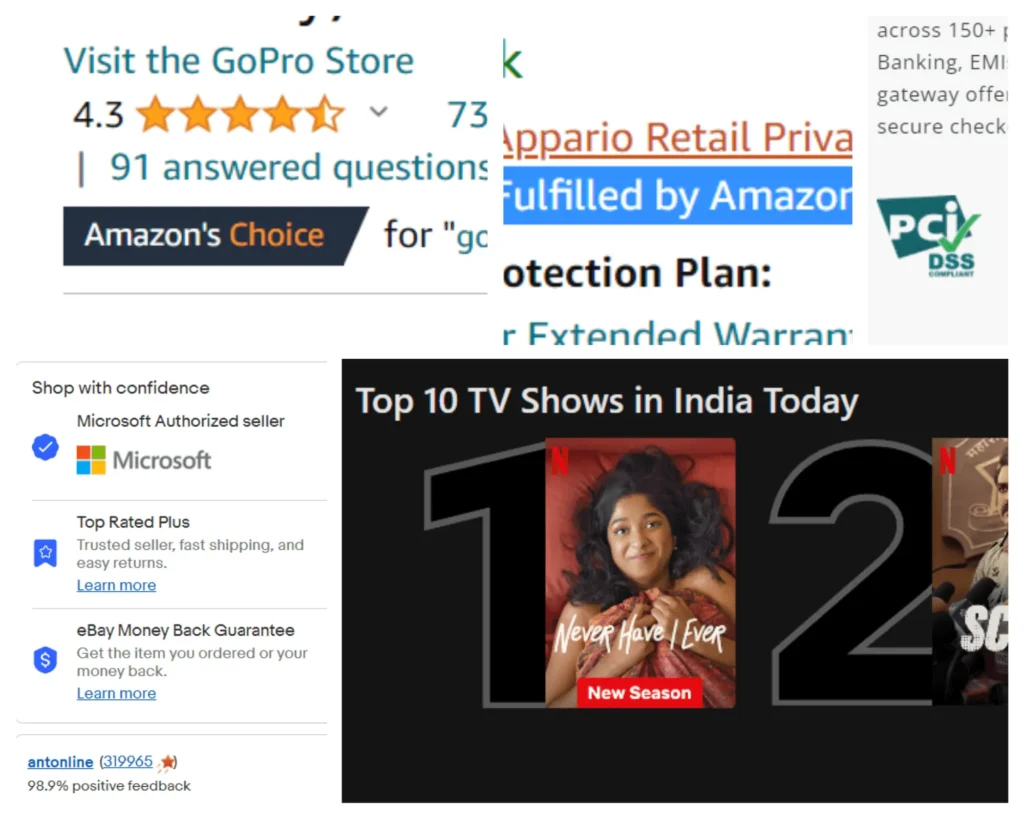
Companies like Flipkart and Amazon showcase trust badges prominently, which reassure customers about the safety of their transactions. Emulating such practises can enhance the trustworthiness of your website.
Accessibility and Trust: Contact Information on Your Website
Before writing this article, I did my research by visiting multiple websites from different domains. This last point is missing in 90% of the website, and I believe that will impact your service. As a customer, before I make a purchase, I want to ensure that you are easily accessible for after-sale service.
I always prefer Amazon over Flipkart for this one simple reason: it’s easier to reach out to Amazon compared to Flipkart. Secondly, it builds trust. Customers buy from businesses they trust.
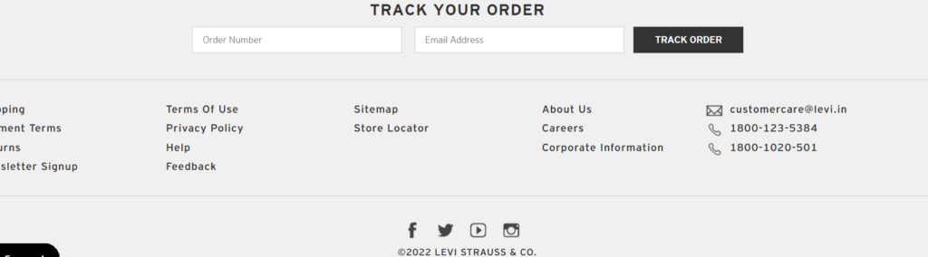
A good example of a website that efficiently incorporates contact information in the footer is the Levi.in website. It contains everything a good website footer should have: a logo, links, social network links, and contact information.
This arrangement not only makes the brand easily accessible to customers but also adds to the overall aesthetic and functional appeal of the website. And their ‘Help’ & ‘Track Order’ buttons are on the right top.
Some Additional Tips For Better Results
- Product title and subtitle: Ensure these are clear, descriptive, and honest to attract relevant traffic. For example, Amazon uses specific and honest product titles without keyword stuffing.
- Descriptions: These should elaborate on the specifics of your product or service. For instance, an online clothing retailer might highlight the type of fabric, fit, and special features in the description.
- Media: Customers are visually driven, so use custom images and videos. Apple, for instance, uses high-quality images and videos to showcase their products from various angles, helping customers visualise the product better.
- Nested navigation: Clear, easy navigation is crucial. Websites like IKEA use breadcrumbs, enabling users to track their navigation path and easily return to previously viewed pages.
In conclusion, Optimizing your website for lead generation with Google Ads is a multi-faceted process, involving everything from customer understanding to site design, social proof, clear CTAs, and trust-building. By integrating these elements into your strategy, you stand a better chance of converting your site visitors into loyal customers, thereby driving your business growth.